Earlier this month we released FlexDeploy 5.6 which is your introduction to FlexDeploy’s journey delivering a next generation UI/UX. With each subsequent release, over the next 18-24 months, you will see continued transformation as our more modern user experience becomes more pervasive across the tool. The final transformation will be a culmination of customer feedback and market trends that will result in a more modern look and feel, responsive UI that supports a multitude of devices and browsers, alignment with standard UX guidelines, and much more.
On the system settings menu you have the option to enable next generation features and user experience (default). When opting in you will see the new user experience in the pages where it is available. Let’s briefly explore what you will find today.
New Screens
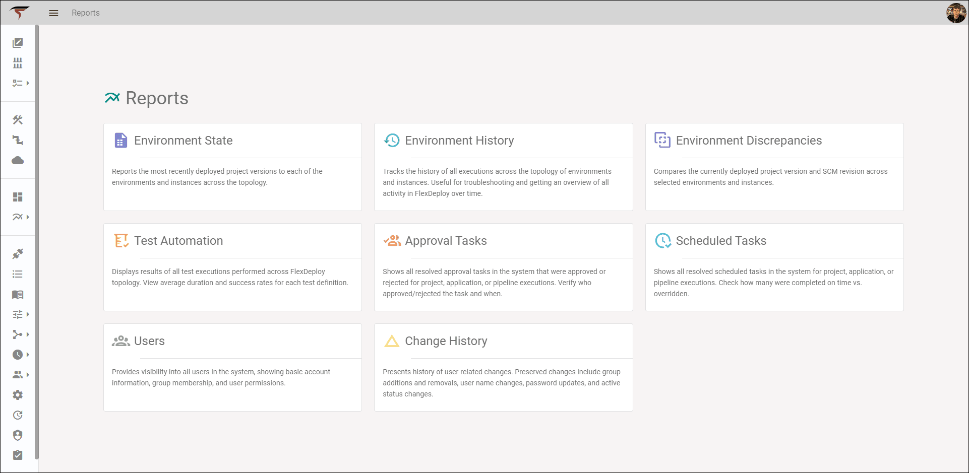
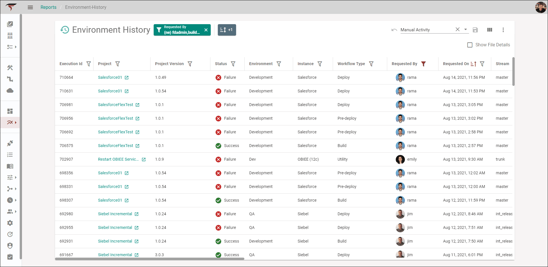
Ultimately, the result will deliver consistency across the application. Today, the transformation begins with two areas. First, all existing reports have been migrated to the new user experience.
In addition, Notification Templates – a new feature available in FlexDeploy 5.6 – also offer new modern screens. These templates enable users to define their own email templates (subject and body) to deliver notification content to subscribers based on the events occurring within the build/deploy/release/lifecycle.

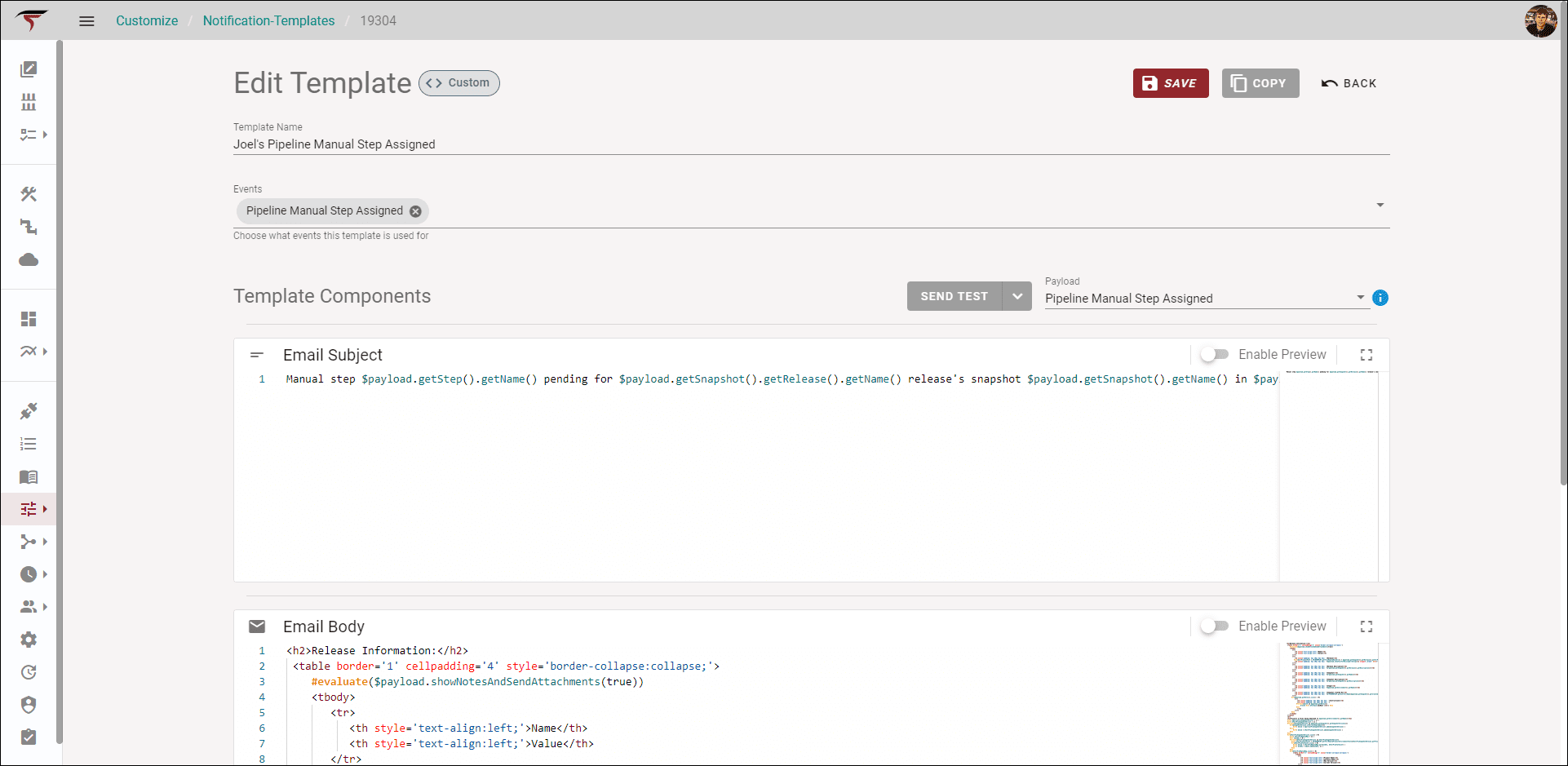
A few note-worthy features of the Edit Template page include:
- The ability to send test emails
- A live render of the email template while its being updated
Check out this blog for additional details on the Notification Templates.
Saved Queries
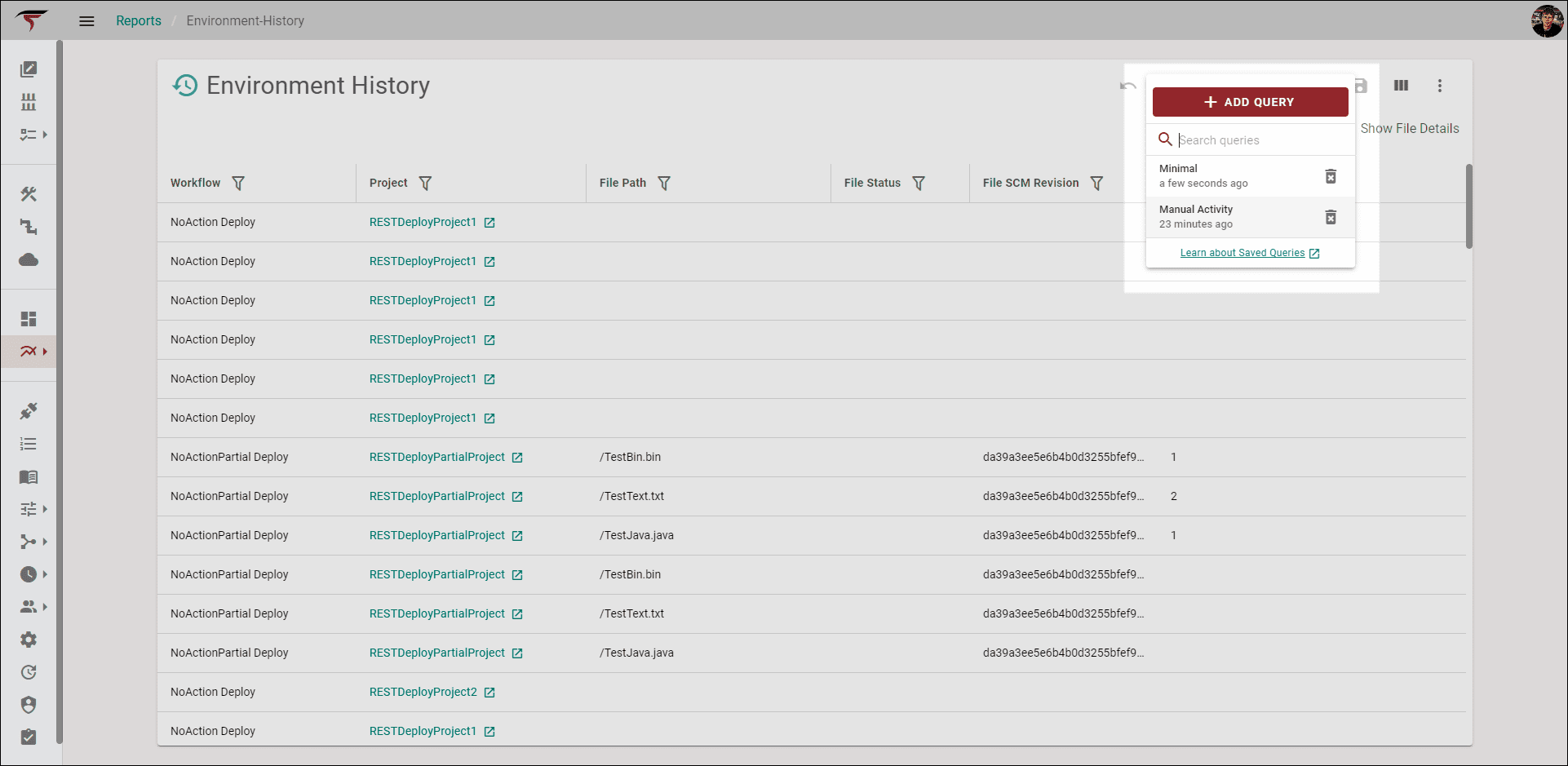
Saved Queries are another new feature within FlexDeploy 5.6. This allows users to save specific filters and display information for a view, such as saving which columns are displayed on a table and what sorts are applied. Saved Queries can also be re-applied at a moments notice. Furthermore, the query that was applied when you left the screen will be the same query applied when you return.
Bonus Features
Not all features shine as brightly as others, but all deserve their moment.
- Browser Navigation – All new screens will honor browser back, refresh, and forward buttons.
- Dark Mode – Under the user profile dropdown, users have an option for Dark Mode reducing screen glare and a better option for reducing eye strain in low light conditions.
- URLs/Bookmarks – All pages, and even filters applied to the page, now come with their own unique URL.
- Monaco Code Editor – That’s right, the same editor that powers VS Code now powers the FlexDeploy Code Editor.
- Gravatar – All user avatars now use users’ Gravatar, if available.
In short, FlexDeploy 5.6 marks the start of an exciting journey towards a modern UI and UX making the solution easier and more gratifying for you. Not to be understated is the voice of the community to help determine the direction of this ongoing change.
Let us know what you think. Tweet your feedback at @goflexagon or comment on Reddit.

